Payment Gateway Testing: Complete Guide, Test Cases & Checklist 2026 – Content gap
October 11, 2026



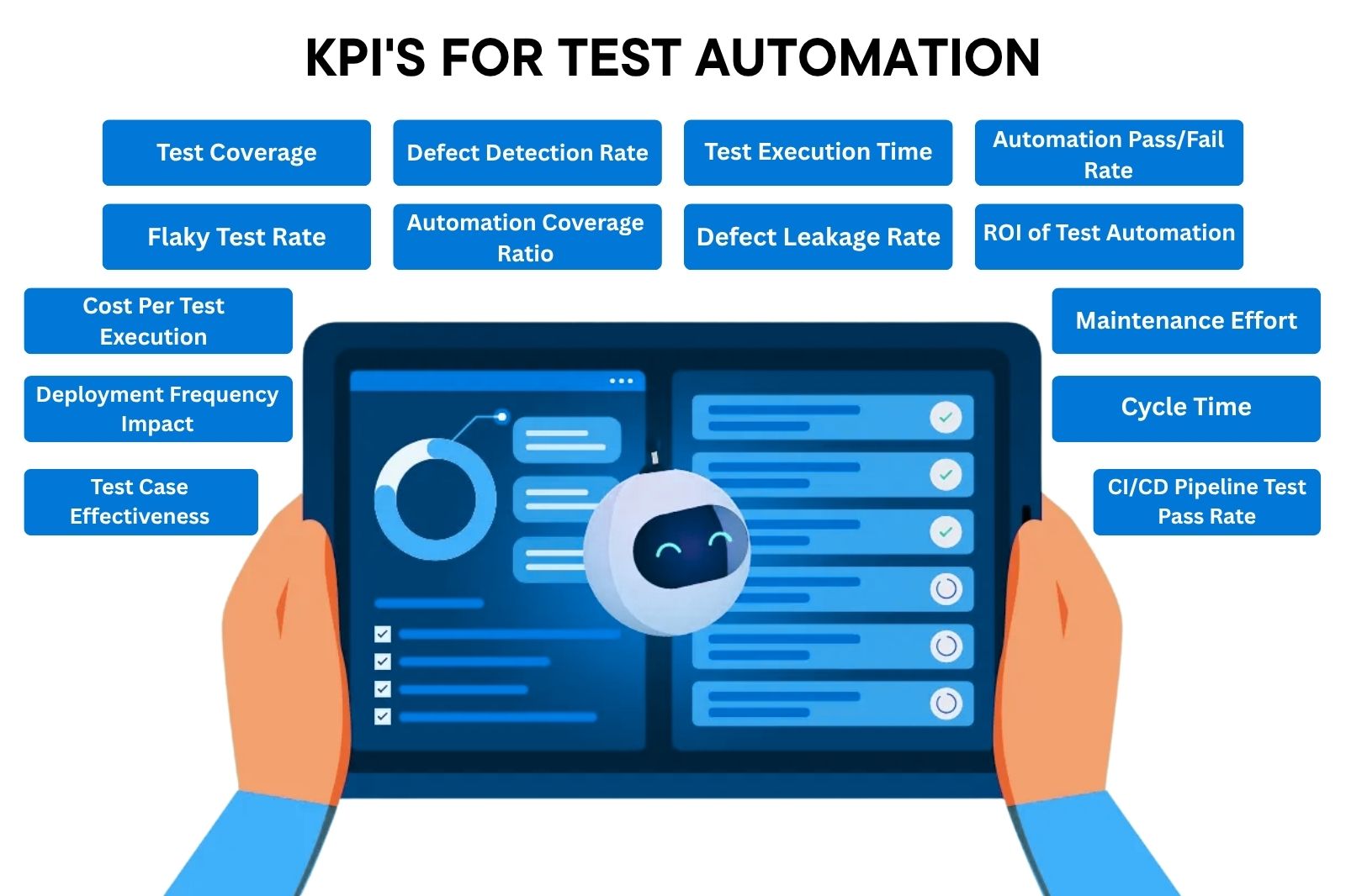
As a technology leader, when you walk into a quarterly review with 14 dashboards, 5,000 automated test cases, and a 92% pass rate.
Your metrics are software language for the room full of business owners, but here’s what your C-suite is really worried about:
Unless you address all of these, your automation initiative is likely to lack the necessary support. Monitor all 16 KPIs at once.
Track all 15 KPIs in one place. We developed a free tool that lets you stop making guesses and measure the KPIs that matter to the board.
Download Metric Tracker →
This article translates the most important test automation metrics into that language:
How long each takes to reach a healthy baseline.
But first, let’s understand what key performance indicators are for Automation Testing and why they are so important.
Stakeholders are curious if they are getting what they are paying for, whether they can make rational decisions about what to release and whether they are seeing actual ROI from the automation effort.
Four business outcomes make automation metrics worth tracking:
14 dashboards created. No board-ready responses. Your QA reporting isn’t helping you move products. We help engineering leaders design QA dashboards the board can use.
A test automation KPI has a purpose. It relates to a business goal, has a target, and has accountability when it moves. That’s what sets it apart.
A metric is simply a number. A KPI is a number that someone is held accountable for.
Test execution count is a metric. “Keep CI/CD pipeline pass rate above 90% to enable weekly releases” is a KPI. The first gets recorded and forgotten. The second one will prevent the next release and has a name assigned to it. Metrics show us the past. KPIs make us take action.
Raw automation metrics do not answer the questions the business is asking. The right KPIs do.
Here are the questions they answer:
Here is a simple way to hold the distinction in your head:
| Metric | What It Measures | Why It Matters |
| Test execution time | Speed of automated test runs | Feedback speed |
| Flaky test rate | Reliability of automation | Trust in results |
| Defect detection rate | How well you find defects | Quality protection |
| Automation coverage | Extent of automation | Risk coverage |
| Maintenance effort | Cost of maintaining the suite | Sustainability |
| ROI | Business value returned | Justification for spend |
Teams that get value from measurement have one habit: they remove the noise that links every number to a business goal. This transforms a dashboard from a status board to a decision tool.
The impulse is to measure everything. That’s a mistake. A total test written counter goes up every sprint.
It’s flashy on a deck.
But it means nothing. Too many pointless numbers in a dashboard is worse than no dashboard at all, because it creates the illusion of control.
Begins with the results that matter to the business. Moves down to the metric that changes it. Each KPI represented on your board should connect to a goal that a stakeholder can understand.
| Business Goal | Relevant KPI |
| Release faster | Test execution time, cycle time, deployment frequency |
| Improve release quality | Defect leakage rate, defect detection rate |
| Reduce testing costs | Cost per test execution, automation ROI |
| Improve automation reliability | Flaky test rate, CI/CD pipeline pass rate |
| Reduce maintenance burden | Maintenance effort |
| Improve feedback speed | MTTD, test failure analysis time, test execution time |
If a metric does not map to a goal on the left, it does not belong on the executive dashboard.
A KPI has to lead somewhere. If a metric moves, does it tell you what to do next? If it does not, stop tracking it.
A high flaky test rate should trigger a stabilization sprint. A rising defect leakage rate should trigger a coverage review. If a number moves and nobody knows what action it implies, it is decoration.
One reading isn’t enough. What an overall 70% pass rate on a fresh set says will be a lot different to 70% on a set that has been in the field for some time and was 95% last quarter.
It becomes valuable when you put this number into context. Week to week. Sprint to sprint. Release to release. And in the context of the team’s past.
Some figures appear to be moving ahead. They are not. Total tests executed, raw pass rate, green dashboards all seem promising and prove very little.
Total tests automated, total test case, script number.
Same trap. They measure activity not results. Beware of one in particular. 95% automation rate means nothing if 40% of those tests are flaky and get skipped. Lean on metrics that impact a ship-or-no-ship decision, and discard the metrics that merely fill the slide.
Not all KPIs are created equal. Leading indicators tell you what is about to happen. Lagging indicators tell you what already happened.
A program based solely on lagging indicators of a program or process keeps you moving forward in the rearview mirror.
These give early signals while you can still do something about it:
These confirm outcomes that already landed:
| Leading KPI | What It Signals | Lagging KPI | What It Confirms |
| Flaky test rate | Reliability slipping | Defect leakage rate | Quality issues that escaped |
| Test execution time | Feedback loop speeding up or slowing | Production incidents | Real release impact |
| Test failure analysis time | Triage efficiency | MTTR | Recovery performance |
| Maintenance effort | Long-term sustainability | Automation ROI | Business value |
Lagging indicators without leading indicators give you half the picture. The leading column is where you intervene. The lagging column is how you know it paid off.
Test coverage tells you what percentage of your system your automation is covering. For executives, the real question is whether the right areas are covered.
Banking platform with 80% coverage without payment processing is not 80% secure. It is totally vulnerable where it really counts.
Coverage gaps seen in production can be found in production incidents reports, SLA violations, and customer complaints. Risk-based coverage where you focus on business-critical workflows provides an argument that can be used by management in case auditors or the board would like to know about your quality assurance process.
Key Performance Indicator formula: (Automated test cases / total testable requirements) x 100
Benchmarks: 70 to 85% for experienced teams. Any number lower than 60% should raise eyebrows in regulated environments.
Time to Achieve: 30 days for baseline. 3-6 months for 70% and higher coverage.
This measures the percentage of defects your automation identifies prior to release. It is one of the most obvious indicators as to whether QA has really provided value or is just running scripts.
A low detection percentage pre-release means more costly to the organization post-release, especially when factoring in customer impact, rollback expense, and regulatory requirements for enterprise software.
KPI Formula: (Defects Found in Testing / Total Defects Found) × 100
Benchmark: Leading teams identify 85 to 95% of the defects prior to release.
Business Risk: Defects escaping to production damage trust and increase support costs. In regulated environments, they can trigger audit findings.
Time to Achieve: This metric can be determined from day 1, and tracked on a sprint-to-sprint basis.
For each hour that your test suite runs, your team will wait an hour to deploy the application. The more your suite takes, the more you will be forced to choose between delays in your release or reducing tests.
Neither is acceptable when quality and speed are key.
For teams using continuous delivery pipelines, the faster the execution, the more frequent the deployments become. Teams who switch from 4-hour suite to 30-minute suite will deploy more often and more quickly and will be able to revert back more quickly in case of errors.
KPI Formula: Wall-clock time between the start of the test run until the generation of the results report.
Benchmark: Under 10 minutes for unit and integration. Under 30 minutes for the regression suite in CI/CD.
Business Risk: With slow suites, there will be a culture of bypassing the test step. Developers will go around tests to make their deadlines, increasing the risk to production.
Time to Achieve: Parallelization and infrastructure improvement can reduce execution time by 50% to 70% in 60 to 90 days.
The pass rate is mistakenly taken to be a quality indicator. A 95% pass rate becomes irrelevant in case of 30% of those being false positives due to poor test execution.
It all boils down to whether the failures are indeed failures and whether the pass rates are indeed true assurance.
Think of this: when the pass rate goes down, do you know immediately and are you stopped from releasing? Mature organizations treat it as a failure mode rather than an observation for the next week’s report.
KPI Formula: Pass Rate (%) = (Passed Tests / Total Executed Tests) x 100. Similarly for fail rate.
Example: 100 tests executed; 85 passed; 15 failed. Pass rate is 85%; Fail rate is 15%.
Benchmark: Stable mature test suites execute at a rate of 90 to 98% on clean builds.
Business risk: False pass rates provide false assurance; false fail rates create false alarm and are ignored. The same issue with a different direction.
Time to Achieve: 2 to 4 weeks.
A flaky test occasionally passes and sometimes doesn’t, even though there’s been no code change.
Together, flaky tests are the top reason engineering teams lose trust in their suites and stop acting on failures.
Google’s engineering team documented how flaky tests at scale created a false signal problem that took real effort to fix. For enterprise teams, flakiness above 5% means your suite is actively misleading the people making release decisions.
KPI Formula: (Tests With Inconsistent Results / Total Tests) × 100
Benchmark: Under 2% is the industry standard. Above 5% needs immediate attention.
Business Risk: High flakiness pushes engineers to re-run tests instead of investigating failures. That masks real defects.
Time to Achieve: Detection is immediate with proper logging. Remediation takes 4 to 8 weeks of dedicated cleanup.
A test failure is an indicator that something went wrong; it doesn’t say what went wrong. The difference between “test failed” and “this is why it failed” is where many of our engineering resources vanish quietly.
We sped up execution some time ago but haven’t yet done the same with triage. In most testing organizations today, triage is the biggest hidden expense.
A test can fail for at least six reasons, and only one is a real defect:
What matters is how long it takes to get from a failure to a diagnosed root cause. That is what a Test Failure Analysis Time measures: the average time from failure to root cause.
At Google’s scale, 84% of pass-to-fail tests are flaky. That means the reflex to investigate every red build burns huge effort on failures that were never real. Manual triage of one failure can cost a senior engineer close to two hours. Junior teammates can lose all afternoon. The cost of a failure is the investigation, not the red mark.
High failure-analysis time compounds fast:
KPI Formula: Average time from test failure detection to confirmed root cause, tracked per failure category.
Benchmark: Highly stack-dependent, but the direction is clear. Platforms that cut average triage time from 40 minutes to 4 are now realistic. AI-assisted failure classification is cutting debugging time by 75 to 80%, with most issues diagnosed in under 5 minutes. If you measure failure analysis in hours, there is a lot of room to close.
Business Risk: Flaky tests are the top reason teams lose confidence in automation. When one failure requires humans to triage it to distinguish true regressions from noise, productivity sinks and the test suite gets ignored. A build that is “red” simply because no one knows why gets dismissed.
Time to Achieve: Baseline measurable immediately with proper logging and failure tagging. Meaningful reduction in 4 to 8 weeks once failures are categorized by root-cause type.
MTTA: Mean time to diagnose a test failure. Unlike MMTR, which measures how long it takes to recover from a failure, MTTA isolates the diagnostic problem that everyone usually measures together, and never breaks out on its own.
The automation coverage ratio shows how much of your test suite is shifted from manual to automation. It reveals the maturity of your automation efforts and scalability.
Manual testing does not scale with release speed. A team conducting 500 manual regression tests per two weeks’ sprint will not be able to continue this practice as the product gets larger. It will let you know if your quality practice scales or requires additional people each time when your product scales up.
KPI Formula: (Automated Test Cases / Total Test Cases) × 100
Benchmark: 40-60% is a good target for a mid-level mature organization; 70+% for organizations with a high release velocity.
Business risk: Low automation coverage ratio means having a manual bottleneck that restricts release speed regardless of engineering’s efforts.
Time to achieve: Within 6 months with a proper automation program in place.
Defect leakage measures how many defects escape QA and reach users. The board sees it in SLA reports. Customer success sees it in support tickets.
In enterprise software, a single high-severity defect in production costs more to fix than a whole month of QA investment. For fintech and banking customers, there is an added regulatory penalty for a leaked defect as well.
KPI Formula: (Defects Found in Production / Total Defects Found) × 100
Benchmark: Under 5% for mature QA programs. Under 2% for mission-critical systems.
Business Risk: High Leaked defects cost customer trust and induce SLA penalties, with added audit exposure for financial services and other regulated industries.
Time to Achieve: Upwards of 30 to 50% gains in 1 quarter is possible with focused automation initiatives.
Here’s the KPI that proves your automation investment to the C-Suite. It balances the cost of creating and sustaining automation with the savings gained through reduced manual testing, quicker error detection, and reduced incidents.
Typically, businesses that correctly track this KPI will see positive return on investment within 12 to 18 months after a structured program.
KPI Formula: ((Cost Savings from Automation − Cost of Automation) / Cost of Automation) × 100
Benchmark: Typically positive ROI within 12 months. 200 to 400% ROI within 3 years for a big program.
Business Risk: Failing to track your ROI will mean your automation investments are overhead; otherwise, it is a proven benefit.
Time to Achieve: Initial results in 6 months; full realization in 12 to 18 months.
Our clients don’t measure ROI. They just know it. On average 300% ROI in 250+ client projects.
See our automation testing services →
Execution cost increases with the suite size. Cloud computing, infrastructure, licensing, engineering. Cost per test execution ensures the cost increase is controlled to make automation economical as its scope grows.
As execution cost per run decreases, more tests can be done on every code change rather than just nightly builds. This results in early detection of bugs when they cost less to solve.
KPI Formula: Total Test Execution Cost / Number of Tests Executed (per period)
Benchmark: Very much dependent on your stack. Try to get a 20-30% reduction in test execution cost per year as the test suites grow.
Business Risk: Uncontrolled execution costs may make automation economically inefficient, causing limited test coverage.
Time to Reach: Baseline KPI instantly measurable. Cost optimization in 30-60 days after analysis.
Test maintenance is the true cost of automation. Ill-designed suites will require maintenance with every change to the application. If maintenance requires more effort from engineers than tests saved, then the automation project is not worth the effort.
The ideal benchmark should be lower than 20-25% of QA engineers’ efforts, otherwise, if it is higher than 40%, then you have constructed an expensive house of cards.
KPI Formula: Maintenance hours per sprint / Total QA engineering hours per sprint
Benchmark: Under 20% of QA time on maintenance. Above 35% points to architectural problems in the suite.
Business Risk: A high maintenance burden slows automation growth and turns QA into a bottleneck.
Time to Achieve: Quantifiable in one sprint. Structural improvements take 2-3 months.
DORA research consistently shows that high-performing engineering teams deploy more often and recover from failures faster. Test automation is a core enabler of that.
Automated highly confident teams implement orders of magnitude more often than non-automated teams. For SaaS organizations, the frequency of deployments correlates with the speed of rolling out new features.
KPI Formula: Deployment frequency before automation vs. after automation, shown as a ratio or absolute change.
Benchmark: Top DORA performers deploy on demand, often multiple times a day. High performers deploy daily to weekly.
Business Risk: No improvement in deployment frequency after an automation investment usually means the suite is not integrated into the CI/CD pipeline.
Time to Achieve: Measurable impact within 60 to 90 days of pipeline integration.
MTTD measures the lag between when a defect is introduced and when your automation catches it. Shorter MTTD means cheaper fixes and faster feedback. It also means less developer context-switching to diagnose issues days after writing the code.
Code that passes review but fails in QA three days later forces the developer to rebuild mental context around work they thought was done. Teams with MTTD under one hour operate very differently from teams where defects surface in the next day’s run.
MTTD includes the point where the failure is discovered, but not the time it takes to figure out the root cause.
KPI Formula: Average time from defect introduction to test failure detection.
Benchmark: Under 1 hour for shift-left teams, under 24 hours for most CI/CD teams.
Business Risk: Longer MTTD means larger quantities of defects before discovery. More difficult and more expensive to trace the root cause back.
Time to Achieve: Inherently measurable from the moment you get baseline data. Shift-left improvements within 30-60 days.
Cycle time is the duration from a code commit to a deployment into production.
For product-focused organizations, cycle time is the benchmark. Being able to react to a defect report in a matter of hours rather than days creates an actual positive impact on retention and customer satisfaction.
KPI Formula: Average time from code commit to production deployment per release.
Benchmark: Top DORA teams run under 1 hour. High performers run 1 day to 1 week.
Business Risk: High cycle time creates release pressure, which leads to skipped testing. That is the opposite of what automation should enable.
Time to Achieve: Improvement visible within 30 to 45 days of pipeline optimization.
Test case effectiveness measures whether your tests are actually finding defects or just confirming that things already known to work still work. It helps you determine what to keep and retire as your test suite grows.
KPI Formula: (Defects Found by a Test / Total Executions of That Test), ranked and analyzed.
Benchmark: No universal benchmark. Focus on finding the bottom 20% of tests that find zero defects over 90 days.
Business Risk: Low effect tests drown your developers and analysts in unnecessary data; no value for effort.
Time to Achieve: This can be analyzed within a quarter of tracked execution data.
This is the metric your DevOps and engineering leadership watches most closely. Pipeline pass rate decides whether code moves forward or gets blocked. That makes it the frontline indicator of build health and automation reliability.
KPI Formula: (Builds Passing All Automated Tests / Total Builds) × 100, tracked per pipeline stage.
Benchmark: 85 to 95% for stable teams. Consistently below 80% points to suite or infrastructure problems.
Business Risk: A low pass rate breaks developer trust in automation. It creates a manual override culture that defeats the point of CI/CD.
Time to Achieve: Measurable from day one of pipeline integration. Stabilization within 30 to 60 days.
The data behind these metrics lives in a few places. Your CI/CD pipeline (Jenkins, GitHub Actions, GitLab CI). Your test management platform. Your observability stack.
The problem comes in bringing it into a single, readable state that both engineering, quality, and your business leadership can interpret.
Where the data lives:
“Real-time dashboards provide the current state view for the QA leads and engineering managers. Trend analysis is done through BI tools and layered on top, and this is the execution story from there.
Showing that defect leakage dropped 40% over two quarters while execution time halved tells a story a static number cannot.
AI-assisted QA analytics platforms like Kualitee surface anomalies, predict coverage gaps, and generate reports that translate straight into executive briefings.
Tracking vanity metrics. Test count and execution count are the usual offenders. A suite executing 10,000 tests sounds amazing. 3,000 of these are duplicates, 2,000 are flaky. The number doesn’t matter. Monitor metrics that have a direct impact on business outcomes as discussed above.
Poor data quality metrics are only as good as the data feeding them. Test results that are not logged consistently, defect records that are not categorized properly, and pipeline runs that are not tagged to releases all degrade your ability to draw conclusions.
Metrics without context. A pass rate of 70% for a new suite is very different from a 70% pass rate for a mature suite that was at 95% last quarter. Just the number does not indicate what to do, trend data and business context do.
Monitor less metrics but monitor them better. Link them to business goals. Automate it so that the metrics stay current instead of becoming a painful monthly task.
Three abilities matter most from a business perspective:
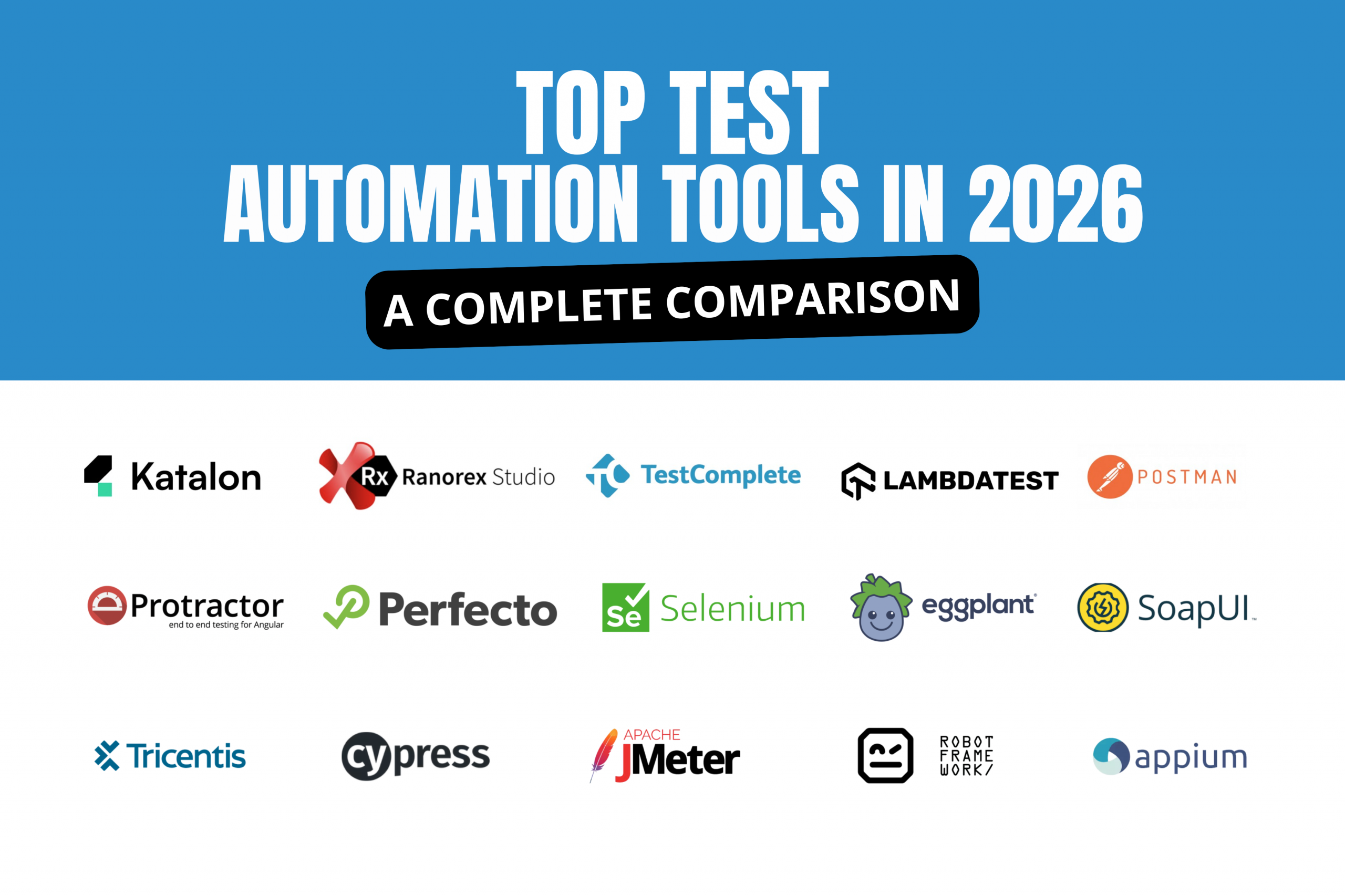
Here’s how the biggest platforms stack up on those three capabilities:
Metrics are not the objective. A reliable product, a confident release, and a worthwhile investment in a quality product are. Metrics will tell you whether you’re on the right track.
The metrics in this article give leadership the tools to ask smarter questions. Not just “Is QA testing everything?” but “where are we exposed, what is it costing, and how fast are we moving?”
Improved measurement doesn’t add complexity to QA. It speeds up QA, since the decision is made with data rather than the next incident showing us something the measurements already knew.
Ready to turn QA metrics into business insights?
Take a look at how Kualitee combines all of these metrics into one dashboard with AI-driven reports for engineering leaders.

Nabeesha is a Digital Content Executive at Kualitatem Inc. With a background in communication and extensive knowledge of QA and cybersecurity, she brings a business-first lens to technical content. Her work helps CTOs and engineering leaders cut through the noise and make confident decisions about software quality.
Not sure where your QA stands?
Speak to an Expert


Our experts are all ready. Explain your business needs, and we’ll provide you with the best solutions. With them, you’ll have a success story of your own.
Contact us now and let us know how we can assist.